SAAC's Team
July 7, 2024
How to Insert a Trendline in Excel

A line of best fit (also known as a trendline) is a straight line that visually represents the relationship between two variables in a scatter plot. It’s a valuable tool for identifying trends, making predictions, and understanding the correlation between data points. In Excel, adding a line of best fit is a simple process that can be done in a few clicks. Let’s dive into the steps.
Understanding the Line of Best Fit
- What it is: A line of best fit is a straight line that minimizes the distance between itself and the data points on a scatter plot. It provides a visual summary of the relationship between the two variables.
- Types: Excel offers various types of trendlines, including linear, exponential, logarithmic, polynomial, power, and moving average. The choice of trendline depends on the nature of your data and the relationship you want to model.
Steps to Add a Line of Best Fit in Excel
-
-
Create a Scatter Plot:
- Select the data you want to plot (both the x and y values).
- Go to the “Insert” tab and click on the “Scatter” chart type.
- Choose the scatter plot style that best suits your data.
-

-
-
Add Trendline:
- Click on any of the data points in your scatter plot to select the data series.
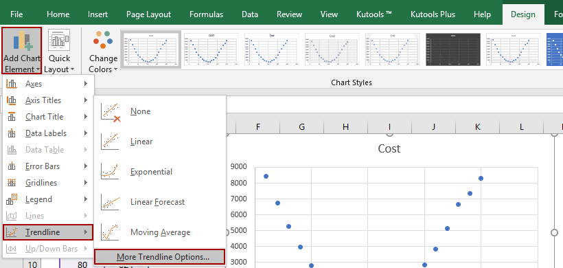
- Go to the “Chart Design” tab and click “Add Chart Element” > “Trendline.”
- Choose the type of trendline that best fits your data (e.g., linear).
-

-
-
Format Trendline (Optional):
- Right-click on the trendline and select “Format Trendline.”
- In the “Format Trendline” pane, you can customize the following:
- Trendline Options: Choose the trendline type, set the forecast forward and backward periods, and display the equation and R-squared value on the chart.
- Fill & Line: Customize the color, style, and width of the trendline.
-

Interpreting the Line of Best Fit
- Slope: The slope of the line indicates the direction and strength of the relationship between the variables. A positive slope indicates a positive correlation, a negative slope indicates a negative correlation, and a zero slope indicates no correlation.
- Intercept: The y-intercept of the line represents the predicted value of the dependent variable (y) when the independent variable (x) is zero.
- R-squared Value: The R-squared value measures how well the trendline fits the data. A value of 1 indicates a perfect fit, while a value of 0 indicates no relationship.
Key Applications
- Predicting Future Values: Use the trendline equation to predict the value of the dependent variable for a given value of the independent variable.
- Identifying Trends: Visualize the overall trend of your data and identify any outliers or unusual patterns.
- Comparing Relationships: Compare the strength and direction of relationships between different variables by analyzing their trendlines.
By mastering the art of adding and interpreting lines of best fit in Excel, you can unlock valuable insights from your data and make more informed decisions.
Subscribe
Login
0 Comments
Oldest


