Detailed Instructions for Labeling Axes in Excel Charts

Axis labels are essential for understanding the data presented in your Excel charts. They provide context and clarity, making your visualizations more informative and easier to interpret. This comprehensive guide will walk you through the process of adding both horizontal (x-axis) and vertical (y-axis) labels to your Excel charts, ensuring your data is presented clearly and effectively.
Why Add Axis Labels?
- Clarity: Labels clearly define what each axis represents, making your chart easier to understand.
- Context: Labels provide context for the data, helping viewers interpret the meaning of the values.
- Professionalism: Well-labeled charts look more polished and professional.
How to Add Axis Labels in Excel
-
Select Your Chart: Click on the chart to which you want to add axis labels.
-
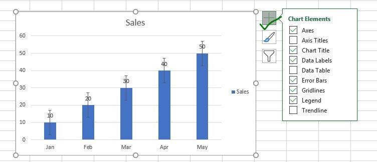
Click the Plus Sign Icon: A plus sign icon will appear near the top-right corner of the chart. Click on it.
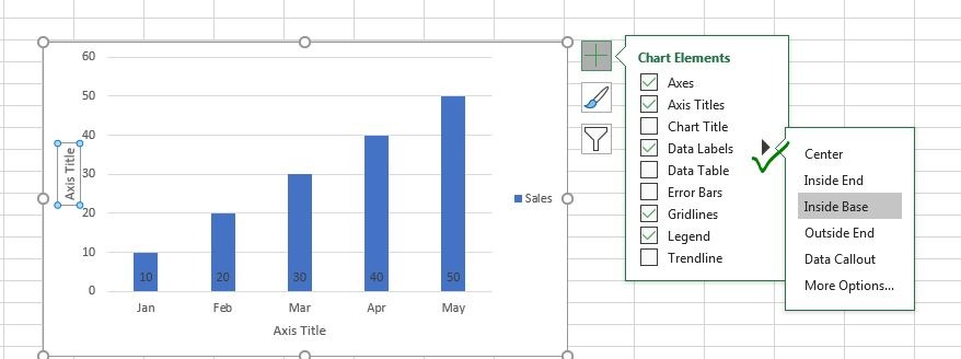
- Check Axis Titles: In the menu that appears, check the box next to “Axis Titles.”

- Enter Your Labels: Text boxes will appear next to each axis. Click inside each box and type the desired label for that axis.
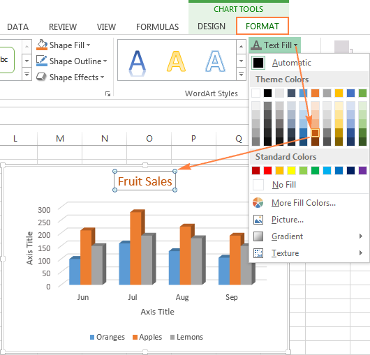
- Format Your Labels (Optional): You can customize the appearance of your labels by right-clicking on them and selecting “Format Axis Title.” Here, you can change the font, size, color, and alignment of the labels.
Alternative Method: Using the Chart Design Tab
-
Select Your Chart: Click on the chart.
-
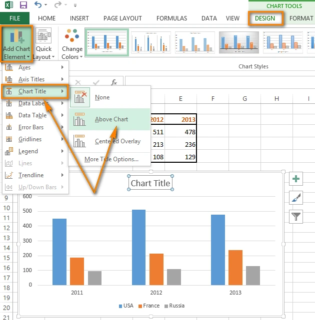
Go to the Chart Design Tab: In the Excel ribbon, select the “Chart Design” tab.
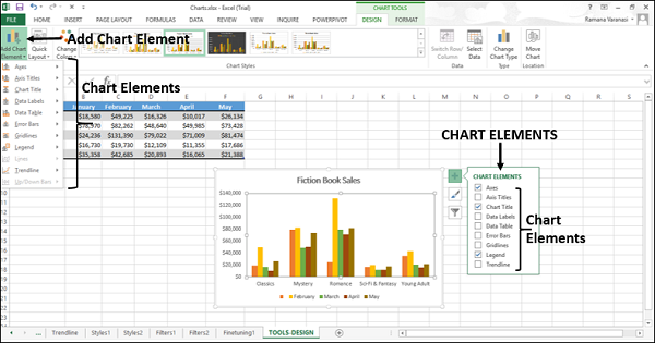
- Click Add Chart Element: In the “Chart Layouts” group, click “Add Chart Element” and then select “Axis Titles.”
-
Choose Primary Horizontal or Primary Vertical: Select the axis you want to label.
-
Enter Your Label: A text box will appear next to the selected axis. Click inside the box and type your label.
Additional Tips:
- Use Descriptive Labels: Make sure your labels clearly describe what each axis represents.
- Keep Labels Concise: Avoid overly long or complex labels.
- Use Units: If applicable, include units of measurement in your labels (e.g., dollars, meters, seconds).
- Format for Readability: Choose a font size and style that is easy to read.
Conclusion
Adding axis labels to your Excel charts is a simple yet essential step in creating effective data visualizations. By following the instructions in this guide, you can ensure that your charts are clear, informative, and professional-looking.
Related articles
» Unable to Add or Create New Cells in Excel
» Excel Header and Footer – How to Add Headers and Footers in Excel
» Excel Add-Ins: Enhance Functionality and Productivity

