Generating Effective Excel Reports: A Data Analysis Guide

Excel is a powerful tool for data analysis, but its true value lies in its ability to transform raw data into meaningful reports. Reports in Excel can be used to communicate insights, track progress, and make informed decisions. This comprehensive guide will walk you through the process of creating effective reports in Excel, ensuring your data is presented clearly and concisely.
Why Create Reports in Excel?
- Data Visualization: Transform complex data into easy-to-understand charts, graphs, and tables.
- Insight Generation: Uncover trends, patterns, and outliers in your data to gain valuable insights.
- Decision Making: Use reports to inform strategic decisions and drive business outcomes.
- Communication: Share your findings with stakeholders in a clear and compelling way.
- Automation: Automate report generation to save time and ensure consistency.
Types of Reports in Excel
- Summary Reports:Provide a high-level overview of key metrics and trends.

- Detailed Reports:Dive deeper into specific data points and provide more granular analysis.

- Financial Reports:Track income, expenses, and profitability.

- Sales Reports:Analyze sales data by product, region, or customer.

- Marketing Reports:Measure the effectiveness of marketing campaigns.

Steps to Create a Report in Excel
- Define Your Objective: Determine the purpose of your report and what you want to communicate.
- Gather Your Data: Collect the relevant data from your sources (spreadsheets, databases, etc.).
- Clean and Organize Your Data: Remove errors, inconsistencies, and duplicates.
- Analyze Your Data: Use Excel’s functions and tools to analyze your data and identify key insights.
- Choose Your Visualizations: Select the appropriate charts, graphs, and tables to represent your data effectively.
- Design Your Report: Create a clear and visually appealing layout for your report.
- Add Text and Explanations: Provide context and interpretation for your data visualizations.
- Review and Refine: Double-check your report for accuracy and clarity.
Tips for Creating Effective Reports
- Keep it Simple: Avoid clutter and focus on the most important information.
- Use Clear Headings: Make it easy for readers to navigate your report.
- Choose the Right Visualizations: Use charts and graphs that best represent your data.
- Tell a Story: Use your report to tell a compelling story about your data.
- Automate: Use Excel’s automation features to save time and ensure consistency.
Tools and Resources for Creating Reports in Excel
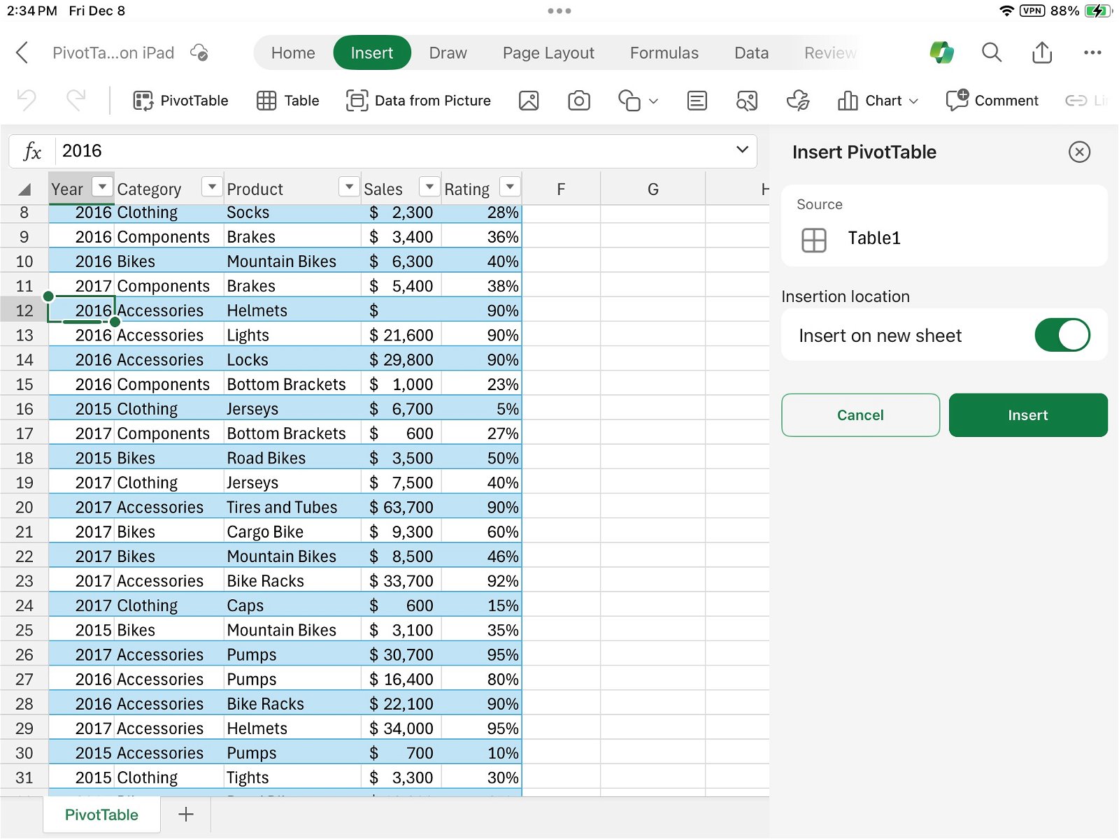
- PivotTables:Summarize and analyze large datasets quickly and easily.

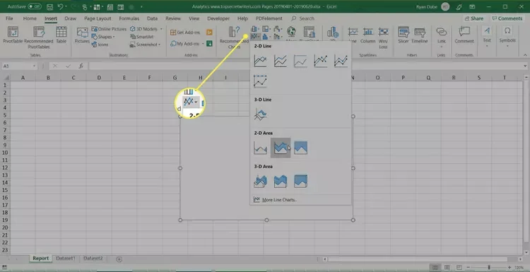
- Charts and Graphs: Choose from a wide variety of charts and graphs to visualize your data.
- Conditional Formatting: Highlight important data points and trends.
- Power Query: Import and transform data from multiple sources.
- Power Pivot: Create sophisticated data models for complex analysis.
Conclusion
Creating effective reports in Excel is a valuable skill that can help you communicate insights, track progress, and make informed decisions. By following the steps and tips outlined in this guide, you can create reports that are both informative and visually appealing.
Related articles
» Unable to Add or Create New Cells in Excel
» Create Word Clouds Excel: Step-by-Step Tutorial
» Beginner’s Guide to Microsoft Excel Online: Manage Data & Create Spreadsheets

