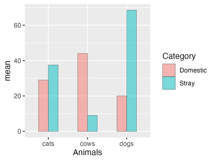
Creating Bar Graphs in Excel
Introduction
Bar graphs are a powerful tool for visualizing data, making them easy to understand and interpret. Whether you’re presenting sales figures, comparing survey results, or tracking project progress, a well-crafted bar graph can quickly convey key insights. In this guide, we’ll walk you through the step-by-step process of creating bar graphs in Excel, from basic customization to advanced techniques.
Why Use Bar Graphs?
- Visualize comparisons: Easily compare values across categories or groups.
- Highlight trends: Identify patterns and trends in your data.
- Simplify complex data: Make complex datasets more understandable.
- Effective presentations: Create visually appealing presentations.
Creating a Basic Bar Graph
-
- Prepare your data: Ensure your data is organized in a clear and concise manner.
- Select data: Highlight the range of cells you want to include in your graph.
- Insert a bar graph: Go to the “Insert” tab and choose the “Column” chart type.
- Customize your graph:
- Chart elements: Add or remove elements like titles, axis labels, and legends.
- Chart styles: Choose from a variety of predefined styles to quickly change the appearance of your graph.
- Data labels: Add data labels to display specific values on each bar.

Customizing Your Bar Graph
-
- Change chart type: Switch between different types of bar graphs (clustered, stacked, etc.) to suit your data.
- Format data series: Customize the appearance of individual data series by changing colors, patterns, and markers.
- Add error bars: Visualize the uncertainty or variability in your data.
- Create a dual-axis chart: Compare two different sets of data with different scales on a single chart.

Advanced Techniques
- Conditional formatting: Highlight specific data points based on certain criteria.
- Sparklines: Create small charts within cells to visualize trends within data ranges.
- PivotCharts: Create dynamic charts based on PivotTables for interactive data exploration.
- VBA: Automate the creation of complex charts using Visual Basic for Applications.
Tips for Creating Effective Bar Graphs
- Choose the right chart type: Select the chart type that best suits your data and the message you want to convey.
- Keep it simple: Avoid cluttering your graph with too much information.
- Use clear and concise labels: Ensure that your axis labels and titles are easy to understand.
- Consider color: Use colors effectively to distinguish between data series and highlight important information.
- Test different layouts: Experiment with different layouts and orientations to find the best way to present your data.
Conclusion
Creating informative and visually appealing bar graphs in Excel is a valuable skill for anyone working with data. By following the steps outlined in this guide and experimenting with different features, you can create customized charts that effectively communicate your findings.
Remember, the key to creating a great bar graph is to choose the right chart type, customize it to fit your data, and keep your audience in mind. With a little practice, you’ll be able to create professional-looking bar graphs that impress your colleagues and clients.
