Adjusting X-Axis Values in Excel: Tailoring Your Chart Displays

Excel charts are powerful tools for visualizing data, but sometimes the default X-axis values might not suit your needs. Whether you want to display specific categories, adjust the scale, or change the order of values, Excel offers several ways to customize your X-axis. This guide will walk you through the different methods, ensuring your charts accurately represent your data.
Why Change X Axis Values?
- Display Specific Categories: You might want to show only certain categories or data points on the X-axis.
- Adjust the Scale: Change the range of values displayed on the axis to better fit your data.
- Change the Order: Reorder the categories or values to emphasize specific trends or patterns.
- Customize Labels: Modify the text labels to make them more informative or visually appealing.
Methods to Change X Axis Values
Method 1: Edit the Data Source

- Select the Chart: Click on the chart you want to modify.
- Click Select Data: In the “Chart Design” tab, click “Select Data.”
- Edit Horizontal (Category) Axis Labels: Click “Edit” under “Horizontal (Category) Axis Labels.”
- Select Range: In the “Axis label range” field, select the cells containing the new X-axis values you want to use.
- Click OK: Click “OK” to apply the changes.
Method 2: Format Axis Options
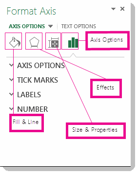
- Select the X-Axis: Right-click on the X-axis of your chart and select “Format Axis.”

- Axis Options: In the “Format Axis” pane, you can adjust various settings:
- Bounds: Set the minimum and maximum values for the axis.
- Units: Change the units displayed on the axis (e.g., thousands, millions).
- Axis Type: Choose between a text axis (for categories) or a date axis (for time-based data).
- Tick Marks: Customize the position and frequency of tick marks.
- Labels: Change the format, position, and alignment of axis labels.
Method 3: Switch Row/Column (Scatter Charts)

- Select the Chart: Click on the scatter chart.
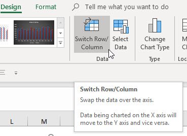
- Click Switch Row/Column: In the “Chart Design” tab, click “Switch Row/Column.” This will swap the X and Y axes, effectively changing the X-axis values.
Additional Tips:
- Data Type: Ensure your X-axis data is in the correct format (text, date, or number) for the type of chart you’re using.
- Data Order: If you want to change the order of categories on a text axis, sort the data in your source table accordingly.
- Custom Formatting: Use custom number formats to display X-axis values in a specific way (e.g., currency, percentages).
Conclusion
By mastering the techniques outlined in this guide, you can easily customize the X-axis values in your Excel charts to suit your specific needs. This will not only make your charts more accurate and informative but also enhance their visual appeal and professionalism.
Related articles
» How to Change Series Name in Excel
» How To Change the Default Browser on Windows 11
» How to Change the Windows 11 Widgets Language

