Adding a Trendline in Excel: Step-by-Step Guide
Introduction
Trendlines are visual representations of the trend in a dataset. They are invaluable tools for data analysis, forecasting, and understanding patterns within your data. In Excel, adding a trendline to a chart is a straightforward process that can provide valuable insights. This guide will walk you through the step-by-step process of adding trendlines to your Excel charts.
Why Use Trendlines?
- Visualize Trends: Trendlines provide a clear visual representation of the overall direction of your data.
- Make Predictions: By extending the trendline, you can make educated guesses about future data points.
- Identify Patterns: Trendlines can help identify seasonal patterns, cyclical trends, or other recurring patterns in your data.
- Support Decision Making: Understanding the underlying trends in your data can help you make informed decisions.
Steps to Add a Trendline in Excel
1. Create a Chart:
-
- Select the data you want to visualize.
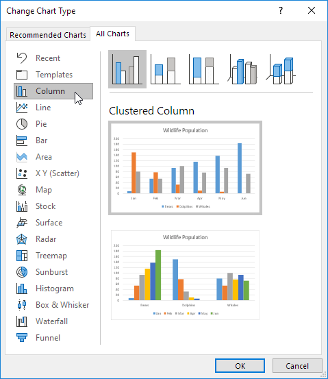
- Go to the “Insert” tab and choose the desired chart type (e.g., scatter plot, line chart).

2. Add a Trendline:
-
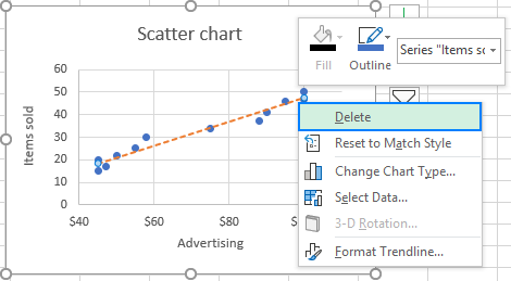
- Right-click on any data point in the chart and select “Add Trendline.”

3. Choose a Trendline Type:
-
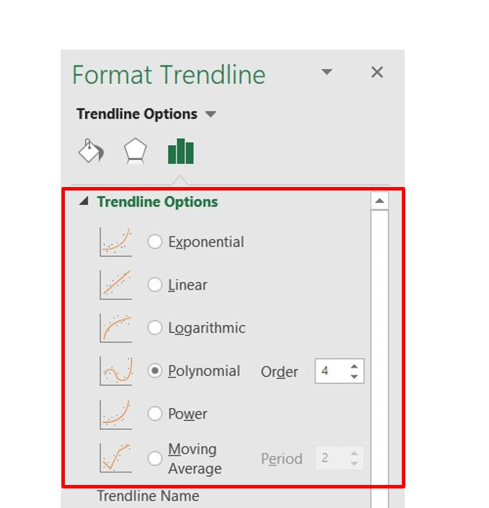
- Excel offers various trendline types, including:
- Linear: A straight line, suitable for data with a constant rate of change.
- Exponential: A curved line, suitable for data that increases or decreases at an increasing rate.
- Logarithmic: A curved line, suitable for data that increases rapidly at first and then levels off.
- Polynomial: A curved line that can fit more complex data patterns.
- Power: A curved line, suitable for data where the relationship between variables is proportional.
- Moving Average: A smoothed line that shows the average value of a dataset over a specific number of periods.
- Excel offers various trendline types, including:

- Select the type that best fits your data.
4. Customize the Trendline (Optional):
-
- Display Equation on Chart: To show the equation of the trendline, check the “Display Equation on Chart” box.
- Display R-squared Value on Chart: The R-squared value indicates how well the trendline fits the data. Check the “Display R-squared Value on Chart” box to show this value.
- Forecast: Extend the trendline into the future by adjusting the “Forward” value.
- Backward: Extend the trendline into the past by adjusting the “Backward” value.

5. Format the Trendline:
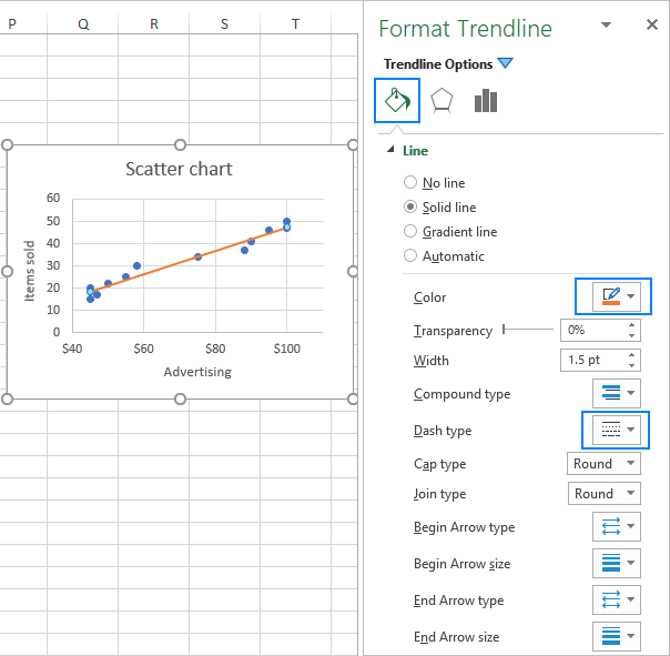
- Right-click on the trendline to access formatting options.
- Customize the line color, style, and thickness.
- Add data labels to the trendline for better visualization.
Tips for Using Trendlines
- Choose the Right Trendline Type: The choice of trendline type depends on the nature of your data. Experiment with different types to find the best fit.
- Consider Seasonality: If your data has seasonal patterns, you may need to adjust your trendline or use a more complex model.
- Validate Your Model: Always validate your trendline by comparing it to historical data and considering external factors that might affect the trend.
- Use Trendlines with Caution for Forecasting: While trendlines can be helpful for forecasting, they are not always accurate. Use them as a tool to support your analysis, not as a definitive prediction.
Conclusion
Adding trendlines to your Excel charts is a powerful way to visualize data, identify patterns, and make predictions. By following the steps outlined in this guide, you can easily create informative and visually appealing charts that will enhance your data analysis.
Remember: The key to effective trendline analysis is to choose the right trendline type for your data and to interpret the results carefully.
[Note: Replace the placeholders “”, “”, “”, and “” with actual images from Google or Microsoft. Ensure the images are high-quality and accurately represent the steps described in the text. Adjust the image sizes and formatting to match the overall style of your document.]

Additional Tips:
- Consider using a combination of trendlines: For complex datasets, you might need to combine multiple trendlines to capture different patterns.
- Explore advanced trendline options: Excel offers additional options for customizing trendlines, such as logarithmic, polynomial, and power trends.
- Use trendlines in conjunction with other analysis tools: Combine trendlines with other statistical tools, such as correlation analysis and regression analysis, to gain deeper insights into your data.
By following these guidelines and leveraging the power of Excel’s trendline feature, you can unlock valuable insights from your data and make more informed decisions.
