How to Create a Pareto Chart in Excel
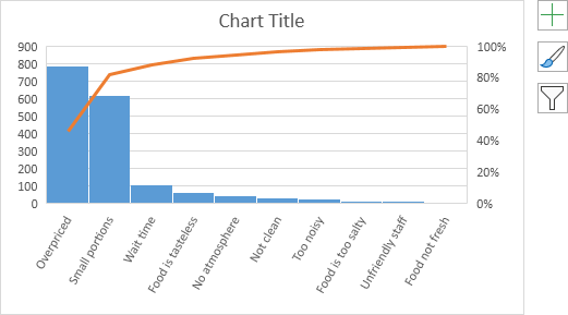
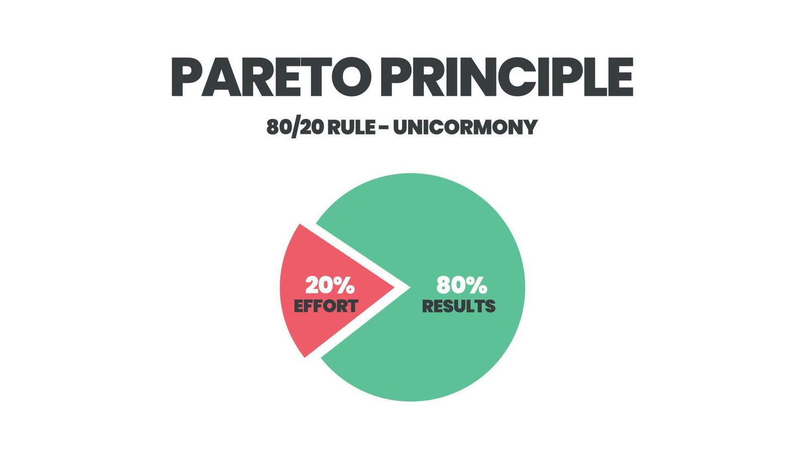
A Pareto chart is a powerful visual tool used to analyze and prioritize problems or factors based on their frequency or impact. It combines a bar chart and a line graph to illustrate the Pareto principle, also known as the 80/20 rule, which states that roughly 80% of effects come from 20% of causes. In Excel, creating a Pareto chart is straightforward, and this guide will show you how.
Understanding the Pareto Chart
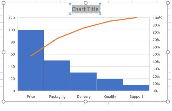
A Pareto chart consists of:
- Bar Chart: Bars represent individual categories or items, arranged in descending order of frequency or impact.
- Line Graph: The cumulative frequency line shows the cumulative percentage of occurrences or impact.
Steps to Create a Pareto Chart in Excel
-
Prepare Your Data:
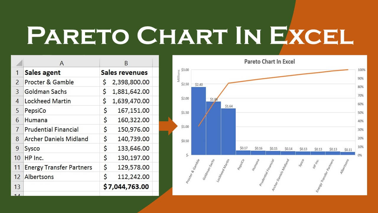
- Organize your data into two columns: one for categories and one for frequencies (counts or values).
- Sort the data in descending order based on frequency.
- Calculate the cumulative percentage for each category.
-
Create a Combo Chart:
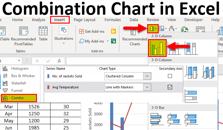
- Select the data (both categories and frequencies).
- Go to the “Insert” tab and click on “Recommended Charts.”
- Choose the “All Charts” tab and select “Combo.”
- Select the “Clustered Column – Line” chart type.
- Click “OK.”
-
Customize the Chart:
- Add Axis Titles: Click the “+” icon next to the chart and check “Axis Titles.” Label the horizontal axis with your categories and the vertical axis with “Frequency” and “Cumulative Percentage.”
- Format Bars: Right-click on a bar and select “Format Data Series.” Adjust the gap width to 0% to make the bars touch.
- Format Line: Right-click on the line and select “Format Data Series.” Change the chart type to “Line with Markers” and set the secondary axis to “Cumulative Percentage.”
Interpreting the Pareto Chart
- Identify Key Contributors: The tallest bars on the left side of the chart represent the categories that contribute the most to the overall effect.
- 80/20 Rule: The cumulative frequency line helps you identify the point where approximately 80% of the effect is caused by a certain percentage of categories (usually around 20%).
- Prioritize Actions: Focus your improvement efforts on the categories that have the greatest impact, as addressing these will yield the most significant results.
Additional Tips:
- Data Analysis ToolPak: If you have the Data Analysis ToolPak installed, you can use it to create a Pareto chart directly. Go to “Data” > “Data Analysis” > “Histogram” and select “Pareto” as the chart type.
- Pareto Chart Templates: You can find pre-designed Pareto chart templates online or within Excel to save time.
- Customization: Experiment with different colors, fonts, and chart styles to create a visually appealing Pareto chart that aligns with your branding or preferences.
By following this step-by-step guide, you can easily create a Pareto chart in Excel and leverage its power to analyze and prioritize your data effectively.

