How to Rearrange Axes on Excel Scatter Charts: A Detailed Tutorial

Scatter charts are powerful tools for visualizing the relationship between two sets of data. However, sometimes you might need to switch the axes to better represent your data or to match a specific analysis requirement. This guide will walk you through the simple process of switching axes in Excel scatter charts, ensuring your data is presented clearly and accurately.
Why Switch Axes in a Scatter Chart?
- Data Interpretation: Switching axes can provide a different perspective on the relationship between your data points.
- Convention: Certain types of data are conventionally plotted on specific axes (e.g., time on the x-axis).
- Clarity: Switching axes can improve the clarity of your chart, especially if the data ranges are significantly different.
How to Switch Axes in Excel Scatter Chart
-
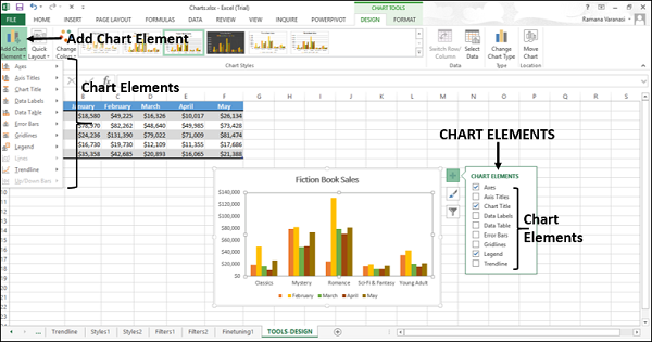
Select the Chart: Click on the scatter chart you want to modify.
-
Click the Chart Design Tab: In the Excel ribbon, select the “Chart Design” tab.
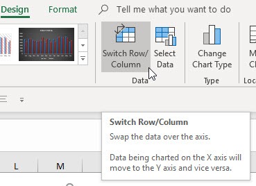
- Click Switch Row/Column: In the “Data” group, click the “Switch Row/Column” button.
- Observe the Change: The axes of your scatter chart will instantly switch, with the x-axis data now plotted on the y-axis and vice versa.
Alternative Method: Select Data Source
-
Select the Chart: Click on the scatter chart.
-
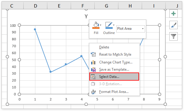
Click Select Data: In the “Data” group of the “Chart Design” tab, click “Select Data.”
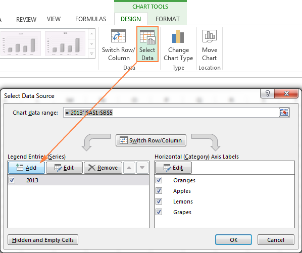
- Edit Series: In the “Select Data Source” dialog box, select the data series you want to modify and click “Edit.”

- Switch X and Y Values: In the “Edit Series” dialog box, swap the values in the “Series X values” and “Series Y values” fields.
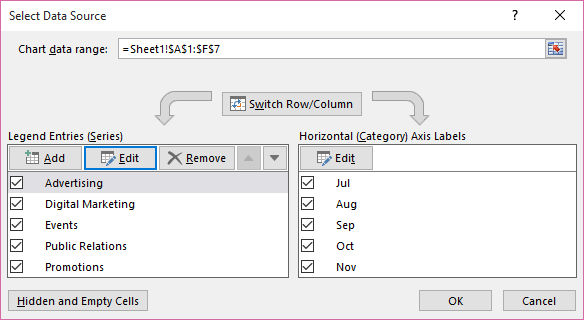
- Click OK: Click “OK” to apply the changes and close the dialog boxes.
Important Considerations
- Data Type: Ensure that your data is suitable for a scatter chart. Scatter charts are best for displaying numerical data where each point represents a pair of values.
- Axis Labels: After switching axes, be sure to update your axis labels to accurately reflect the new data arrangement.
- Chart Title: Update the chart title if necessary to reflect the change in axis orientation.
Conclusion
Switching axes in Excel scatter charts is a simple yet powerful technique for improving the clarity and interpretation of your data visualizations. By following these easy steps, you can quickly adjust your charts to suit your specific needs and preferences.
Related articles
» How to Switch Column in Excel
» Creating Charts in Excel: A Step-by-Step Guide
» Creating Dynamic Pivot Charts in Excel – Step-by-Step Guide

